The aphorism popularised by Mark Twain ‘lies, damned lies and statistics’ highlights that quantitative data is not as neutral and objective as we might like to think. Statistics – numbers, charts, graphs – can be used to clarify and support good arguments as well as obscure and bolster weak arguments. This is also the case with maps.

In an earlier post, I looked at some examples of presenting in map form the results of the 2017 Western Australian state election. However, developing a thematic map to display the election result is more than a case of summarising data and laying over a map. The context and framing of the map is crucial. Consider this map:

There are no labels, no legend, there is no explanation of what the colours mean or even where the map represents.
Despite this, some guesses might be made. Someone from elsewhere in Australia would (should?) recognise it as the state of Western Australia. The way the land is divided up, it might be guessed as state or federal electoral divisions, and if that was the case, the colours might be recognised as the standard hues adopted by the major parties: red for Labor (on the political left), blue for the Liberals (on the right) and green for the National Party (mainly on the right, but centred in rural areas).
If a viewer from outside Australia recognised the shape as the western part of the country and guessed it was an electoral map, the colours might lead to an incorrect conclusion. Although it was not always the case, in the US, for example, red is for the Republicans (on the political right) and blue for the Democrats (on the political left). This confusion is easy to clear up:
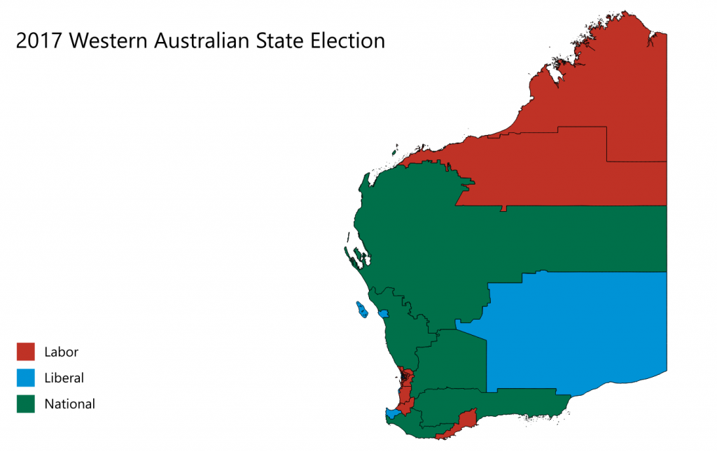
With the map labelled, we know where and to what the map represents. It would appear that the battle was between green and red, with blue closely behind. For the record, the Labor party needed 30 seats to form government and won 41. Liberal secured 13 seats and the Nationals 5. All the seats the Nationals won can be seen here.
Now, let us zoom in to a section of the metropolitan area:
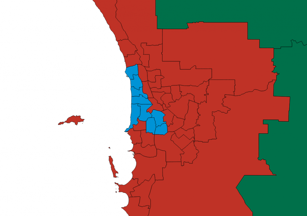
Based on the usual party colours – red for Labor, blue for the Liberals and green for the Nationals – we have quite a different picture. The same data is being used. Since the main voter base of the Nationals are mainly in rural areas, the seats they win are, to be expected, outside the metro area. In contrast to the full map of the state, it certainly looks like Labor won most of the metro seats and the Liberals were left with only a handful. It would be reasonable to conclude from this version that WA Labor had a crushing win. A local may also be able to make a few guesses about which suburbs are in blue. From these guesses, an interesting question would be why are all the blue seats close together like that?
Consider this map, with some labels and a title:

The map itself has not changed – it is identical to the previous one – but with the title focusing on money and with the blue suburbs named, a local will recognise the ‘western suburbs’ of Perth as those were the wealth is located, or at least, where it is perceived to be located. For the left-leaning voter, it might ‘just go to show that the moneyed interests will always vote Liberal.’ A right-leaning voter might be annoyed by the polemics of the title and instead, be encouraged by a core election base that can be built on to win a new election.
The second image was ‘field tested’ on a Facebook group page broadly sympathetic to the Labor victory and generated a variety of comments. Some wanted to squeeze out the remaining blue and thought the same could happen at the next Federal election. Some commented that the map ‘visualised’ a class divide in Perth. Interestingly, some were keen to distance themselves from those around them whose politics they did not agree with; a small pocket of dissenters. For some areas this could be the case and an example can be seen in the booth map from my previous post on the election.
While it is true that a win is a win, maps like this also hide how close some of the results were, some needing several layers of preferences to reach a decision.
Conclusion
These are pretty straightforward examples of maps (potentially) misleading us. It is worth being mindful, I would argue, that the same kinds of principles we should apply when we look at graphs, charts, infographics and the like are worth applying here: questions of scale, data types, appropriateness of the chart/graph type, coverage, time and so on need to be applied to maps. Along with these other forms of data visualisation, there is always something more going on than the ‘pure’ display of data.