
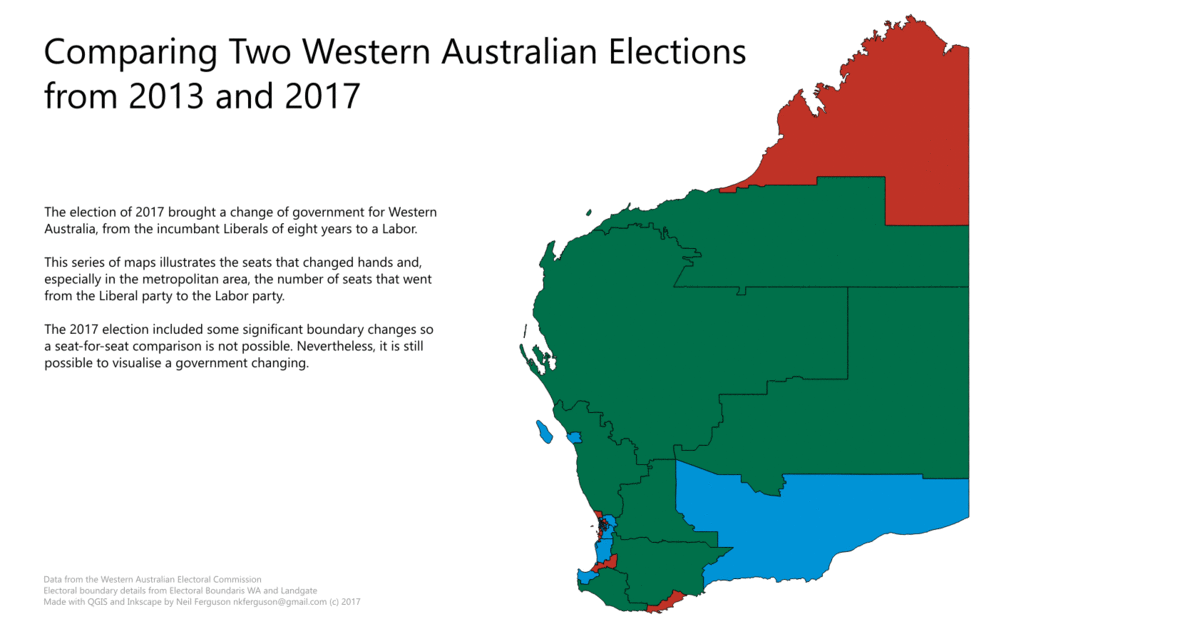
The 2017 state election in Western Australia delivered a substantial victory in the lower house to WA Labor. They needed to gain 10 seats to reach 30 in the parliament to win and ended up with 41. Consequently, the Liberal/National alliance, in office since 2008, was left with 18, with many former ministers losing their seats. Elections can be mapped to a fine detail with the WA Electoral Commission providing counts down to the booth level.

Introduction.
An election provides a range of data that is a natural target for mapping. This is especially useful for skill development, as the data is easy to understand, and the polygons are (for the most part) easy to obtain.
Simple Map.
A first idea is to simply map the whole state’s electorates and which party was successful. The polygon files were easy to download from the WA Boundaries site, available as a MapInfo file which can be read directly by QGIS. The Western Australian Electoral Commission (WAEC) provides the results of the election and I created a simple csv file from this information. Each of the state electorates has an associated id number and so it was a matter of assigning the correct election win to the right electorate id. This was then imported into QGIS and joined to the polygon file. There are only three parties that successfully gained any seats and so there are only three categories. It was then only a matter of changing the colour categories to something close to those for each of the parties.

Animating the Change of Government.
Given the comprehensive victory of WA Labor, it seemed obvious to make an animation of some sort to see the shift from Liberal to Labor happen. This proved to be a little more difficult since for some as yet unknown reason, the WAEC and WA Boundaries – the government sections directly responsible – do not provide polygon files in any form for any other election even the one immediately prior. I asked the question on their site and was, essentially, fobbed off to Landgate, presumably, their data service. It appears from the reply I received, that Landgate make the files based on the information provided to them, a fee-for-service to WA Boundaries. After a good deal of searching and enquiries, I was able to find them as shapefiles.
With QGIS it was possible to have the two different elections in the one file and export images at different zoom levels. These were then imported into Inkscape to add titles and export them again as png files. But how to animate?
The animation had me stumped for a while as many of the online sites keep the animation for universal access. I had been looking for another project where this was not appropriate (part of my university work). Fortunately, I found EZgif.com, a free online gif maker with a number of useful options and you need to save it offline as the files are automatically deleted soon after. Perfect.
Here is a screenshot of the final result. Click for a live version:
Localised Maps.
The WAEC also release the first preference data for each booth in each electorate. This is important data and can be used, for example, in predicting the election as those numbers come in on election night. It can be quite revealing when visualised. Here is a booth map for the electorate of Cottesloe held by the now former premier of WA, Colin Barnett:

As the description accompanying the map shows, while most of the electorate is strongly Liberal, the southernmost booth, in North Fremantle was split almost evenly. The next door electorate of Fremantle has, for most of its life, been Labor or Greens, that is, on the left. It can easily be seen how, as boundaries are changed, predictions might be made on an electorate’s future electoral fortunes based on historical data from polling booths. Here is a paper from 2007 that combines this data with Census data to develop a predictive model.
Conclusion.
Elections have impact on all members of a community and provide data that can be easily mapped but also investigated in a variety of ways. Powerful and free software is available so that anyone with a computer and an internet connection can explore. I will explore some of these options in later posts as well as some hidden (and not so hidden) agendas and unintended consequences.