Background
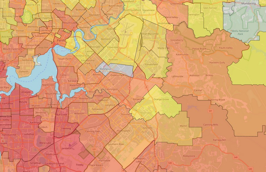
During the campaign to stop the construction of the Perth Freight Link/Roe 8 project, a regular claim was it is only ‘tree hugging unemployed hippies’ and ‘professional protestors’ who object. This was addressed with photos of people holding a card with ‘I am a [job/profession] and I do not support Roe 8.’ An additional objection was that it was only a few people near to the highway that were unhappy. The purpose of this map was to demonstrate that opposition to the development is from all around the Perth metropolitan and WA. It was not just a NIMBY argument (not in my backyard). Part of the description that accompanied the map noted that:
While some of the counts are low, those taking the pledge can be considered the highly committed end of a spectrum of opposition. For every person who has taken the pledge, there are many more who want improved and expanded public transport, rail freight and other sustainable and economic freight solutions – not a highway through the Beeliar wetlands and woodlands.

Originally, a colleague wanted a static map of the metro area. Her intention was to gather data to verify that it was not a local issue only. This was already clear from talking to people and social media posts. This proved a little difficult to manage. A better solution would be a dynamic map using data that was already data available: postcodes of people ‘taking the pledge.’
Development.
The map needed two types of data.
The first was a file that combined the postcode with a corresponding count. It began as a raw Excel files (from the website) and handwritten forms from meetings and rallies. The data was de-identified, leaving a long lists of postcodes, each representing an individual. It was next amalgamated to provide one postcode with a total count, for example 6163 has a count of 624. This process meant records were excluded if a suburb or postcode was not provided or it was unreadable.
The second was postcode boundaries. For some peculiar reason, Australia Post do not provide an easily available file showing the postcode boundaries. You can buy one for a large some of money in a subscription. Luckily, the Australian Bureau of Statistics developed an equivalent version they call ‘postal areas.’ This file was then modified to include only Western Australia.
A csv file of postal areas/counts and the modified shapefile of the postal areas were imported into QGIS. For this map, I used an inbuilt plugin to import various basemaps. Then, an additional plugin called qgis2web made the dynamic web version. I was unable to persuade qgis2web to translate all the choices I made in developing the map. For example, I wanted to use the Bing street map but was only able to get it to work with Open Street Maps. It was also necessary to ‘fool’ the plugin to get some of the colours to work and modify file names to make the legend work properly.
Summary.
The map was developed for the Rethink the Link website. This group (along with those working toward the same goal) are run exclusively by volunteers – there are no paid protestors. So, the free and open source nature of the tools I needed to make the map is great.
QGIS is a powerful GIS program using plugins, built-in or imported, to achieve some of its tasks. One of these is qgis2web which produces all the HTML, CSS and JavaScript files needed to make the map work on a site. There are lots of tutorials available on YouTube and in blogs and whatnot. I also got a little help from a great (and at the time on sale) Udemy tutorial by Ardit Sulce. That the qgis2web plugin did not do everything I wanted is not really a problem as the QGIS software does a lot more than any one plugin would be able to manage.
The data source does not change very rapidly and it is not necessary to change the map each time someone takes the pledge. The next challenge will be to explore options for maps that are able to adjust ‘near live’ as changes to a source are made. There already are some online options for travellers and the like and Google fusion table maps can update via Google forms. Can these be adapted to keep track of rallies and protests as they happen, say with feeds from people’s mobile phones?